Monday, July 30, 2012
Rich and Cheap
A guy has a huge wine collection, numbering into the tens of thousands of bottles, valued in the millions. He hides the "good" bottles of Kistler chardonnay (the one that gets one point higher from RP) from his wife by placing them on a high shelf where she can't reach them.
Wednesday, July 18, 2012
Rex Harrison
In Frank Langella's book, Dropped Names, he writes about what a monster Rex Harrison was off-screen. According to his ex-wife, Elizabeth Harris (who was also married to Richard Harris), "He was the only son of a bitch who would send the wine back at his own dinner table."
Thursday, July 12, 2012
Old Bones Night at Comme Ca
Winos dinner at Comme Ca, July 12, 2012
Stony Hill Chardonnay
Aubert Chardonnay
Marcassin Chardonnay
Aubert Chardonnay
Marcassin Chardonnay
Course/Flight 1: Old
Bones Cabs with Duck Confit
1970 BV GDL (Smith)
1975 Mayacamas (Gelb)
1978 Heitz Martha’s Vineyard (Malo)
1978 Ridge Monte Bello (Bennett)
1978 Joseph Phelps Insignia
Course/Flight 2: 1984
cabs with Coq Au Vin
1984 Grace Family (Kaplan)
1984 Dunn Napa (Posell via MK)
1984 Dunn HM (Rauch via MK)
1984 Diamond Creek Gravelly Meadows
(Page via MK)
1984 Diamond Creek Volcanic Hill (MK)
1984 Diamond Creek Red Rock Terrace
(MK)
Course/Flight 3: 1987
cabs with Comme Ca Burger
1987 Ch. Montelena (Griffith via
Malo)
1987 BV GDL (Abrams)
1987 Dominus (Gelber)
Course/Flight 4: Petite
Sirah with Cheese
1974 Freemark Abbey York Creek PS
(Gelb)
1990 Sean Thackrey Marston Old Vines
PS (Abrams)
Saturday, July 07, 2012
Sauvignon Blanc like an expert
I am picking up the pen again after a lengthy absence. The Best Cellar is now blogging for Birchbox Man (more on that later). Here is the first in a series:
Eskimos
have 100 words for snow, and for good reason: they’ve got a lot of snow in
Alaska, and it’s not all the same. The closer you look at anything, the
more you start to draw small distinctions. All rap music does not sound
the same if you’re paying attention.
Wine
geeks have about a million descriptors to identify the aromas and flavors in
different wines. Wine Spectator magazine proudly announces that they reviewed over
700 wines in the latest issue, including a number of New Zealand Sauvignon
Blancs. That’s a lot of wine to describe in neat little paragraphs, and
they’ve got a responsibility to their readership to make it sound like all
Sauvignon Blancs are not the same. To be sure, New Zealand
Sauvignon Blancs are more aromatic and over-the-top in style than those from
the US, or the classic style of the Loire Valley in France, so it pays to
sniff, swirl and slurp the wine.
The Spectator used all of the following to
describe the various Sauvignon Blancs: petrol, lanolin, spice notes (“notes” is
good word to drop), honeysuckle, fresh grass, fresh chive, peach and tangerine
finish (“finish” is the sensation that lingers in your mouth after the wine is
on its way down your throat), passion fruit, guava, pickled ginger, spiced
pear, kiwifruit, talc, lemongrass, fresh thyme.
Nothing is out of bounds.
It may
seem like a silly parlor game, but it’s pretty useful to be able to describe
what you’re smelling and tasting. And if
you taste several bottles of the same kind of wine side-by-side, you get a
better sense of how these descriptors really do help define what it is that you
like (or don’t) about a wine.
Try
to be specific—the more specific the better.
“Citrus” isn’t bad, but “lemony” is better, and “Meyer lemon” or “lemon
zest” is better still. Crunchy green
apple, succulent nectarine, oolong tea. These all get bonus points for
creativity.
Tie it
all together with adjectives like elegant, balanced, bright, refreshing,
smooth, vivid, tangy, zesty, round, juicy and, my favorite: bracing acidity.
Mix and
match like “Madlibs” and you get something like: A juicy and vibrant white that
features notes of key lime pie, white grapefruit, and green tea, giving way to
flavors of coconut water, ripe pineapple and dried mango. Bracing acidity
adds plenty of punch to its elegant finish.
These are
perfect for summer sipping. Three of the
best widely available Sauvignon Blancs from New Zealand to look for are: Kim
Crawford, Cloudy Bay, and Dog Point, all around $20.
Monday, September 26, 2011
The Most Insincere Form of Flattery
There is no less sincere form of flattery than James Suckling's critical review. He's the Will Rogers of wine. He is making a mockery of this whole thing, and he knows it. You want to get a lot of recognition? Give a lot of high scores that can be used on shelf-talkers at retail. He is a total fraud.
Friday, July 08, 2011
Desert Island Wines
I'm leaving for Martha's Vineyard tomorrow night on the redeye. My wife and I decided to bring some wine in my FAA-authorized case. I would actually prefer to go on a wine holiday, a holiday from wine, but it's not practical to do so. The selection is weak, the prices are terrible and there's no (or low) corkage at most restaurants. So I've got six spots. Five, if you give one to a liter bottle of Kettle One for Mrs. What are the five Desert Island wines, keeping in mind that it is an island...in July? And Mrs. doesn't like CA Chardonnays. So out goes Marcassin, Aubert (that could make it through, but I only have the new 09s), J. Rochioli, etc. As of this writing, and you know how packing goes, I've got a Fevre Chablis (Les Clos 04), Leflaive Puligny Montrachet (Pucelles 05), Boillot Chassagne Montrachet (I forget which), and a Volnay. No American wines for my All-American holiday? But how would I like a Les Pavots on a 70+-degree night in July...with a lobster roll? Developing.
Friday, June 10, 2011
Why Not Judge Books By Their Covers?
http://newyork.grubstreet.com/2011/06/sloshed_maybe_we_should_be_jud.html
Sloshed: Maybe We Should Be Judging Wines by Their Labels
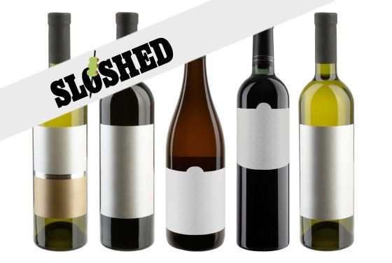
Like plenty of normal people, I buy wine mostly based on the label. Sure, price is important — and those little cards with the scores help, too — but, frankly, if I do not like the label, I will not buy the wine, simple as that. You know that wine with the three moose wearing sunglasses? It’s called 3 Blind Moose? Yeah: I hate that label. I will never buy that wine. This is actually reasonable, I think. Unless you have an extensive knowledge of regions and grapes, the wine you choose is simply not going to matter all that much. What’s the worst that can happen? Unless it literally tastes like those sweat socks that wine people insist on using as a flavor comparison, you still end up with a bottle of wine you can drink. And last time I checked, a bottle of wine will get you nicely buzzed with your friends over the course of an evening no matter what you choose. So why not choose based on the label?
And so, a proposal: If labels are so important to our wine-buying choices — and I am saying they are — then we should understand labels just as we understand the other non-label parts of the wine (e.g., the grapes and the regions and stuff).
But while you can go on the Internet and find very detailed wheel-based charts for wine aromas and tastes, there is woefully little label categorization.
But while you can go on the Internet and find very detailed wheel-based charts for wine aromas and tastes, there is woefully little label categorization.
Not to worry: I have gone into the field and done some research. I wanted to know whether I could identify the types of labels I liked and which turned me off. I think I have identified seven major wine-label groupings along with several subclasses. I also tasted a bunch of wines according to their labels and have made wildly ill-advised extrapolations about what the label means for your drinking experience. And so, here is the wine label kingdom.
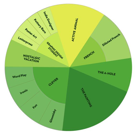
The only authoritative chart on wine labels that you're likely to see today.Illustration: Jen Cotton
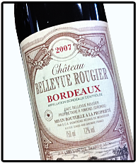 The French
The grand-cestor of all wine labels; the French is very word-heavy and relies on classic fonts most of the time. Owing to French wine laws, this label must contain specific data on where this wine was made, where the grapes were grown, and who made it. This standardization means that most French wine labels look the same and are all equally intimidating.
What to Expect: The words Appellation Bordeaux Contrlôlée Mis En Bouteille a La Propriété should tell you everything you need to know. It's the fancy stuff, and it will taste sort of like dirt, but in a good way.
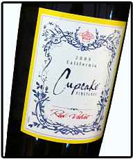
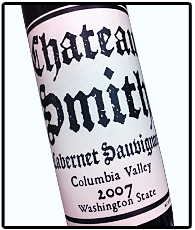
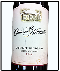 French Subclass: Diluted French
Take the French label and remove a lot of the words. Voilà! These give the feeling of a French label — tradition, upper class — but without all the confusing detail. You usually get the grape name, the region, and they usually try to shoehorn the word “chateau” in there somewhere. Also, there is often a pen and ink drawing of a house that we are meant to believe is the aforementioned chateau.
What to Expect: The winemaker often isn't actually French, but is instead an American making wine in the French style. That means it will taste sort of like dirt andfruit. You know how people say, “I don’t know, tastes like red wine to me”? This is what they are talking about.
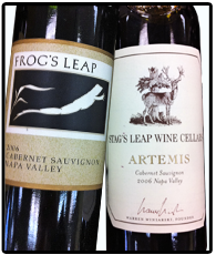 Animals Doing Things
A close cousin of Diluted French, these labels often contain exactly the same information as the D.F., but instead of featuring a chateau, they are named for an animal, which is often doing something. That “something” is usually leaping.
What to Expect: The Animal label began as a solidly American genre, but those Australians sure have taken to it, though with way more marsupials. They're often from big producers, but these wines tend to stick their landings. (Yes, that is a gymnastics reference.)
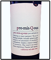
 The Graphic Design Student
This class description is not meant as derogatory; rather, they are simply very design-y. I find a lot of these labels to be focused on their attitude, a sort of “we don’t have to adhere to your chateau and scripted-font tradition.”
What to Expect: Wine from a small-ish non-European producer (or a small-ish subsidiary of a large producer), the wines themselves can vary a lot, depending on the subclass of the label design.
 Graphic Design Subclass: Letterpress
Have you seen those greeting cards where there is some nice serif font that says something like “Thank You” and then there is an equally nice image of a dandelion on it? And also a lot of white space, and it sort of looks like a wedding invitation? That’s what these wine bottles look like.
What to Expect: Smooth wines usually, not super-tannic (i.e, cotton-mouthy), not super-fruity or earthy. Defined more by what they are not. Which is not a bad thing, I don't think.
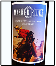 Graphic Design Subclass: Poster Art
These labels want you to recognize that they are not like those other labels. Instead, they look like a poster from some other era of graphic design — usually a cowboy or hippie poster for some reason.
What to Expect: Interestingly, while the design itself tends to hit you over the head ("Get it?! It looks like a wanted poster from the old west!"), you can expect wines with a bit more reserve and class. I should say: The labels are well designed usually. Perhaps the wines follow suit.
 Graphic Design Subclass: Pottery Barn Catalogue
Totally innocuous with respect to design, these labels looks like those leather-bound books you see in catalogues. That is their whole purpose: looking good next to a bowl of Granny Smith apples on a butcher block counter.
What to Expect: American wine that tastes like the vanilla-scented candle they always put in those catalogue rooms.
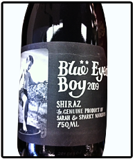
 Graphic Design Subclass: Indie Designer
These can also vary wildly in style, but again: You will know it when you see it, especially if you are someone who reads Print magazine. Some of my favorite tricks in this genre: huge black text on white; a black and white photograph of people in the Dust Bowl or the Gulag; custom R. Crumb–style illustrations.
What to Expect: Syrah. Or a blend with Syrah in it.
Nostalgic Small-Town Vacation
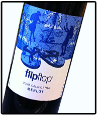 “Do you like vacations? What about sand dollars and/or the beach? Yeah, we like those things too.” That’s me doing an imitation of the Nostalgic Vacation label. These wine labels are sort of ingenious in that they skip over the wine entirely — “Who cares what grape it is! There’s a flip-flop on the label!” — and go straight to the lifestyle you imagine yourself having while you drink it. Shells, sand dollars, anything beach related, really — but there’s a subgenre here: labels with nostalgic Coca-Cola style drawings of red trucks, front porches, or anything a person might associate with small-town America.
What to Expect: I have had enough hangovers to know with full certainty that these are cheap wines that taste like hangovers. Often very sweet, they aim for smoothness über alles, but this gives them basically no structure.
“Do you like vacations? What about sand dollars and/or the beach? Yeah, we like those things too.” That’s me doing an imitation of the Nostalgic Vacation label. These wine labels are sort of ingenious in that they skip over the wine entirely — “Who cares what grape it is! There’s a flip-flop on the label!” — and go straight to the lifestyle you imagine yourself having while you drink it. Shells, sand dollars, anything beach related, really — but there’s a subgenre here: labels with nostalgic Coca-Cola style drawings of red trucks, front porches, or anything a person might associate with small-town America.What to Expect: I have had enough hangovers to know with full certainty that these are cheap wines that taste like hangovers. Often very sweet, they aim for smoothness über alles, but this gives them basically no structure.
 Clever
Clever labels attempt to make you smile as you walk by. The hope is that you might appreciate a little joke, a little fun, after looking at all those chateau drawings. I identified a couple of mini-classes of the clever label.
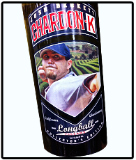
Gimmicky: “I sure do love my local professional sports team. So much so that I cannot pass up this wine with Boston Red Sox starting pitcher Josh Beckett.”
What to Expect: Young, young wine that's bought in bulk by somebody like Charles Shaw and then sold for cheap. These are often one-liners. And while that one line might be Steven Wright quality, most are Rodney Dangerfield level.
What to Expect: Young, young wine that's bought in bulk by somebody like Charles Shaw and then sold for cheap. These are often one-liners. And while that one line might be Steven Wright quality, most are Rodney Dangerfield level.
Ironic: “Ha! I’m looking for a cheap red wine and look: That one is called Cheap Red Wine. Perfect.”
What to Expect: See above. In fact, all of the wines in these categories might be from one huge batch. Wouldn't that be ironic?
What to Expect: See above. In fact, all of the wines in these categories might be from one huge batch. Wouldn't that be ironic?
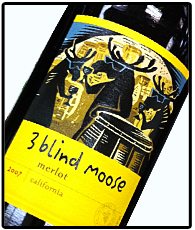 Fun: “Honey, look — you know how I love moose, right? Well, look at these crazy moose! They are wearing sunglasses!”
What to Expect: Ah, forget it. All this wine is the same. Have you had Yellow Tail or Carlo Rossi? That's what this stuff is like. Thin fruit, sometimes jammy, but never more than one note.
Word Play: “Pinot Evil? Ah … cute. Look at those monkeys!”
What to Expect: Would it blow your mind if I told you that these wines were incredible? Well … they aren't. They're the same crap as all the stuff above.
What to Expect: Would it blow your mind if I told you that these wines were incredible? Well … they aren't. They're the same crap as all the stuff above.
 Painting
 Whereas most labels will have some sort of image that supports the words on the label, the Painting labels just throw a painting of whatever on there. And it’s very specifically a painting — lots of colors and obvious brushstrokes. You will not confuse this with a pen drawing of a chateau or a leaping animal. No, it’s like they licensed some of the lesser impressionists and are just going through them.
What to Expect: For some reason, you see a lot of these types of labels on Italian wine. But note that Italian wines generally have to follow similar rules that the French do, label-wise — a lot of words telling you things you don't understand — so anytime they're throwing a painting on there, I'm always a little suspicious. In other words, if you buy one of these, you'd better know what you're doing.
 Euro-Trash A-hole
A rare sighting, the A-Hole label is usually more than a label. Often, the whole bottle is some unique shape. Look! I’m a wine bottle in the shape of a shampoo bottle! Deal with it! Whatever.
What to Expect: I wouldn't know, for I do not condone this sort of behavior. And neither should you.
Obviously, I have not tasted every single wine in the world that has a label. I have simply tasted most of them, and I actually do find a relationship between label and wine. If I like the graphic design, I tend to like the wine. I chalk this up to two things:
1. We are a suggestive people. If I like how you look, I will tend to like you, or at least, I am inclined to like you. (But if I don't like how you look, watch out.)
2. I make the assumption that the crew who makes the wine also chooses the label, at least at some level, right? So, when a label appeals to me, I think: "Well, I like their font choices. I probably like their wine choices, too."
But maybe you disagree? Have you ever loved a label and hated the wine? Or vice versa? This is what the comments are for, people.
Matthew Latkiewicz works for the Internet; he writes and podcasts about drinking and other subjects at You Will Not Believe. His work has appeared in McSweeney's, Wired, Time.com, Boing Boing, and Gastronomica. Tragically, his wifelike girlfriend is allergic to wine.
